
I was approached late in 2010 with the project of designing a line of barbecue sauce labels for a new local restaurant concept. The restaurant, Company 7 BBQ, wanted to have their proprietary line of sauces and one rub ready to go on opening day. The only problem was the timeline: about 2 weeks total to design and get labels printed. I initially wanted to decline the project because of the tight timeline so near the holidays.
I spoke with the folks and learned they are a family of firefighters and seemed like good people, so I accepted the project. It was the least I could do for those who have put their lives on the line to help others.
I knew concepting would be intense and stressful. I did my standard steps of research and thumbnailing, however, I put myself on a strict timer for each stage and really just cranked out whatever came to mind.
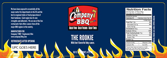
I developed four initial concepts, mocking up the mildest and hottest sauce to show the progression of “heat”. Version A was to gradually up the flames in the background against a dark blue background:
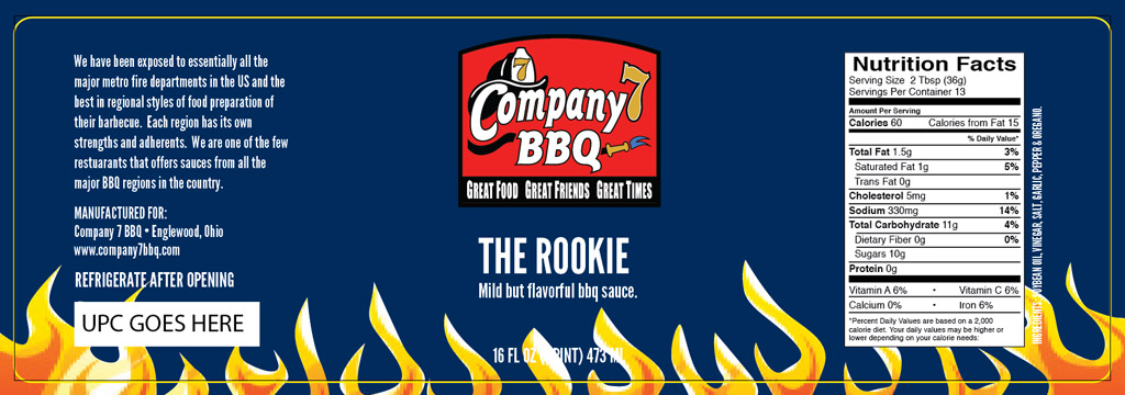

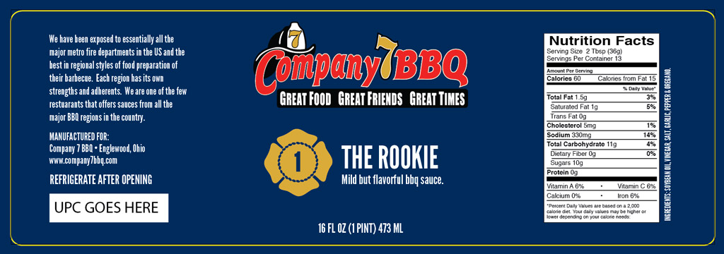
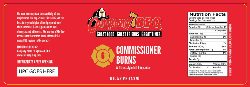
Version B was simple, bold solid colors in the background from “uniform blue” to “fire engine red” and the heat scale was numerical starting with 1 and going up to 6 within the firefighter maltese cross symbol:
Version C was based on the very cool Peter Pirsch fire truck that is the centerpiece of the Company 7 BBQ bar area:


Version D based on the idea of fire damage, the hotter the sauce, the more the beat up and textured the label would become:
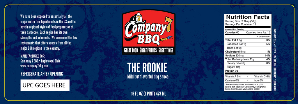

In the end, the client chose version B, the bold solid colors. I worked up retail and in-store versions as quickly as I could and they were able to open with some labels on sauces. Response to the restaurant has been fantastic from what I’ve heard. If you’re in the area, be sure to check ’em out!