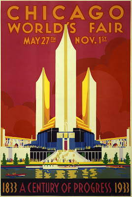
While I was in Chicago this summer for HOWDesign Live, I went to Willis Tower for the Skydeck tour. While in the gift shop, I shot a pic of the Chicago World’s Fair poster.
In July, while discussing the cheese show poster for my day job at Dorothy Lane Market with our Cheese Director, he mentioned the theme this year was “Cheeses of the World”. I immediately thought of this poster and how it could be a great reference for our poster.
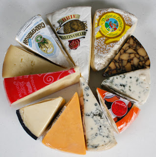
A challenge in creating this poster is what image to use. How to convey cheeses from different countries? Cheeses that might be of different sizes and shapes would be difficult to manage. However, I worked with our Cheese Director and came up with the idea of picking out wedges of our most popular cheeses that would be at the show. I then shot a photo of them:
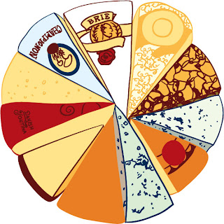
Then began the long process of tracing them in Illustrator keeping true to the Art Deco colors of the world’s fair poster. It took a bit of work, but it did work out:
I then added it to my poster composition and it was a perfect match. I decided to shy away from a straight Art Deco typeface and chose Junction from The League of Moveable Type to give it a hint of the past, but with a modern touches:
©Dorothy Lane Market. Used with permission


